The Colorboss plugin for Adobe Photoshop consists of a main panel with four tabs. Each tab is described in detail below. Click the tab name below or scroll down to view details.
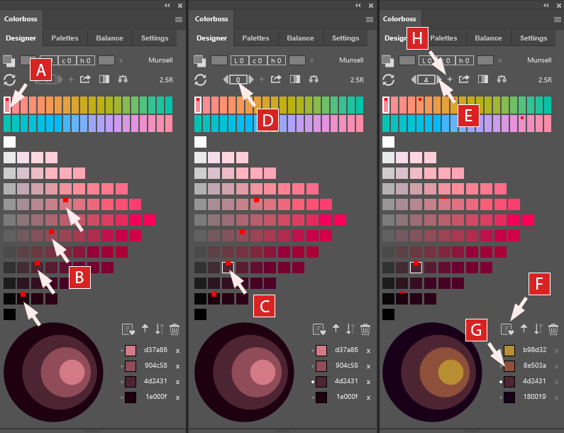
A. Select Hue: To quickly start using Colorboss, select a hue from across the upper hue bar (here it is 2.5R) .
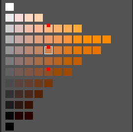
B. Select Swatches: Select multiple color swatches in a diagonal or vertical row from the selection grid. A red marker square will appear over the swatch and the color will appear as a new row in the hex color list along with a new preview circle. Remove swatch selections on the main grid by clicking on the red marker or from the list by clicking the ‘x’ on the hex row.
C. Select Anchor Swatch: Click again on one of the selected grid swatches to make it the active anchor color which will not move during stepping of the other colors. A white border appears around the swatch on the grid to mark it as anchor and a small white dot next to the hex row.
D. Activate Stepper: The stepping counter and arrows become enabled at the top of the panel when an anchor is selected.
E. Step Hues Around Anchor:Clicking the stepper arrow keys (left or right) changes the step distance and the hue separation of the other colors around the anchor swatch. The step counter moves from -20 to +20. With each step, the swatches are separated in hue by that amount.
F. Add Palette: Click the favorite button to add the current variation to the Palette library while stepping.
G. Change Foreground Color: Click the list color swatches to change the current Photoshop foreground color. This also makes the list row the current anchor and will switch the hue and main grid to match the selection.
H. End Stepping Mode: To leave stepping mode accept the current color scheme by clicking the ‘+’ button next to the stepper (E) or click the step counter (D) to re-zero back to the original selection.
Important Note – Once in stepping mode (E) no further colors can be added to the list (B) or removed until the current step number (D) is either accepted (by clicking ‘+’ to the right of stepper E) or resetting back to zero to reset the original selection (by clicking the step counter D).
1. Designer Tab
Designer Interface Overview
The Designer tab is the heart of the Colorboss plugin, offering a powerful and intuitive workspace for creating, exploring, and refining color schemes.
The Designer interface is divided into 4 sections.
A) The top section has two rows of tools and mode controls.
B) The second section is the Munsell based hue selector.
C) The main swatch selection panel provides a visual and interactive grid to design ordered color schemes.
D) The bottom section consists of a circular preview panel of the selected colors and a hex code swatch list. The swatch hex list can be reordered by drag-and-drop or using the reorder function buttons as described below. The preview circles are updated as the hex list is updated.
A) 1st Row Controls
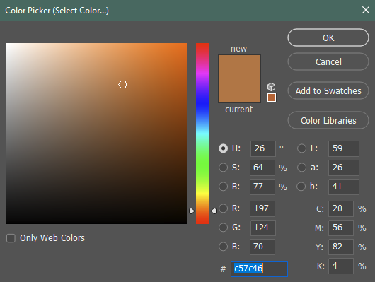
a) Open Color Picker:
The left corner color picker button opens the Adobe Photoshop standard Color Picker. This familiar interface allows for precise color selection using various methods including RGB, HSB, Lab, CMYK and hex input controls, and the eyedropper tool for sampling colors directly from your document.
After the Color Picker is closed the exact-color and near-color selection buttons are both updated with the selected color and the rounded visual Lch difference values between them are displayed.
b) Add exact-color selection:
After selecting an exact color with the Color Picker, it appears as the face color on the left button. Clicking this button adds the exact color swatch to your current scheme, and shifts all the other grid colors by the same Lch offset for visual consistency.
This feature is useful to match specific brand colors or when starting with a precise hue in mind.
c) Add nearest-color selection:
The right-hand gray rectangle displays the closest Munsell color to the exact selection. Clicking this button adds the nearest Munsell color swatch to the scheme.
This feature is useful when working within the Munsell color system or needing to find standardized colors visually similar to selected custom colors.
d) Lch Color Difference Values:
The CIE Lch color notation is a polar coordinate version of the linear CIE Lab notation system – it is a circular derivation with the lightness value ‘L’ remaining the same between the two systems.
The three values displayed (L = lightness, c [or ‘C’] = chroma, h = hue) show the rounded difference between the exact selected color (left button) and the nearest Munsell color (right button). The ‘h’ is a degree value around a 360 degree spectral circle and the ‘c’ [or ‘C’] is a visual distance value from a central neutral gray axis similar to the Munsell neutral axis.
The Lch offset feature is invaluable for understanding the transformation required from the selected exact color to find the closest standardized Munsell color.
*Note* The Lch transform values are rounded for visual brevity but accurate decimal values are used internally for critical calculations. Also note that because of the simplified rounding display, very similar colors selected using the Color Picker may appear to share the same rounded Lch offset values.
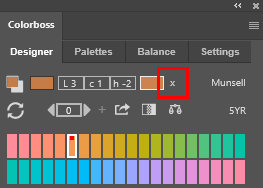
e) Cancel offset:
The ‘x’ button serves as a reset function, clearing the current color selection and setting the Lch offset back to 0,0,0.
If an exact color has been added to the color scheme, then the Lch offset that is automatically applied to other grid swatches is reset to zero but will not change exact color swatches already on the hex selection list (described later).
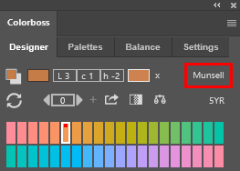
f) Mode Switch:
The button labeled ‘Munsell’ toggles between Munsell and an HSV color mode. The HSV mode provides an alternate range of colors based on an HSV algorithm (Hue, Saturation, Value). Each hue is seeded with an actual Munsell color before being processed.
*Note* The HSV mode is only a helper function and offers an alternate swatch selection set to the traditional Munsell palette but it is not a recognized or standardized color set.
A) 2nd Row Controls
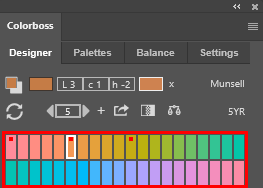
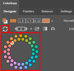
a) Hue Selection Mode:
The circular arrow icon toggles between two ways of visualizing and selecting hues: a linear complementary color mode (shown here) and a circular color wheel mode (shown below).
The linear mode presents Munsell hues in two rows that make it easy to see complementary color relationships. The circular mode arranges hues in a traditional color wheel which is helpful for identifying triad and split-complementary color schemes.
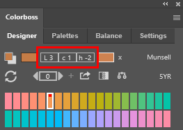
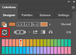
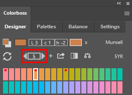
b) Hue Stepper:
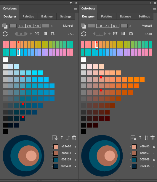
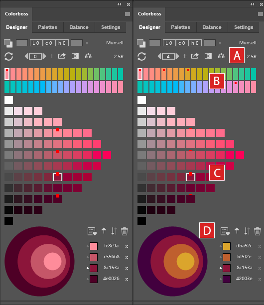
This powerful tool can explore hue variations of the current color scheme. It becomes active after an anchor swatch is selected from the current color scheme.
An anchor color is selected by clicking on a hex list swatch or re-clicking a swatch on the main selection grid. An anchor swatch displays a white border on the main grid, and a white dot on the hex list. There must be at least two selected colors on the hex list before an anchor swatch can be set.
The up and down arrows shift the hue of the non-anchored colors in the scheme. Each step represents a symmetrical shift in hue away from the anchor swatch up to a maximum of 20 steps.
Hex list swatches above the anchor swatch are shifted in one direction and swatches below the anchor are shifted in the opposite direction. The hex values are updated with each hue step.
If a swatch is shifted to a hue that has no corresponding color for the chroma and value position, it is temporarily hidden until a valid location becomes available at the next step.
Each step shifts swatch hues symmetrically by the step value while maintaining the original value and chroma positions. This is an excellent way to explore different moods and feelings within a single color harmony sequence.
*Note* the hue stepping function if helpful as an exploration tool only – it does not provide an exhaustive set of possible variations for multi-color schemes (i.e. 3 or more colors), or for manually selected or asymmetrically shifted color schemes.
Stepping variation around anchor color.
c) Set Color Scheme:
The ‘+’ button to the right of the stepper is used to commit the current hue step distance to the color scheme. This sets the current hue positions of the swatches and resets the step counter to zero. After committing the scheme, the hex list can be altered by adding, removing or moving colors as needed.
*Note* During stepping the various color schemes can be used as Gradients and Balances or saved as favorites to the Palette library without setting a final commit using the ‘+’ button – however swatches cannot be added, removed or moved on the hex list during the hue stepping process.
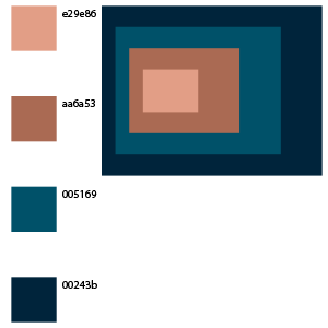
d) Export color scheme to layer:
This button creates a new layer in your Photoshop document that is populated with swatches of the current color scheme.
Each exported swatch is labeled with a hex code for easy reference.
The layer export also includes a rectangular context display showing how the colors work together – a rectangular version of the circular preview panel.
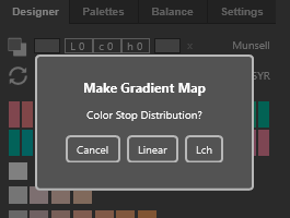
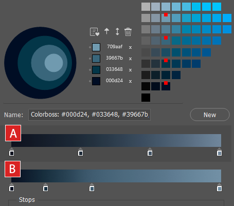
e) Add Gradient Map:
With at least two colors in your scheme, this button becomes active. It generates a gradient map adjustment layer in Photoshop based on your selected colors.
This feature is excellent for quickly applying in-between blended colors to document images or for creating unique color effects.
An option dialog opens to select even Linear color stop distribution or uneven lightness based Lch distribution.
The example shows the difference between the different gradients created.
A) The Linear option distributes color stops with equal spacing along the gradation.
B) The Lch option distributes color stops with unequal spacing along the gradation based on the natural lightness ‘L’ of each color.
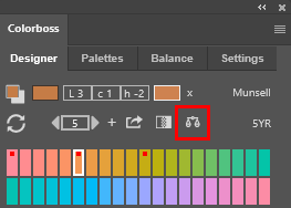
f) Add Color Balance:
When you have three or more colors in your scheme, the Balance button becomes available.
A new color balance is created in the Balance tab library using just the top three hex list colors in your scheme. Here the example shows a new Balance named ‘Balance 31’ by default.
Then a new balance adjustment layer is automatically created in Adobe Photoshop using the top three hex listed swatches for the balance highlights, midtones, and shadows respectively.
More detail is available in the Balance Tab section
With experimentation and exploration, this becomes a powerful way to apply selected color schemes to images to overlay a cohesive mood based on your chosen palette.
g) Active Hue Label:
This label updates in real-time to show the currently selected hue in Munsell notation (e.g., 2.5B, 5B, 7.5B). It’s a helpful reference point as you navigate through different hues.
B) Hue Selector
Hue Selector:
In linear mode, you’ll see 40 Munsell hues arranged in two rows. Each pair represents complementary colors at middle value and chroma. This layout makes it easy to see how colors relate to their complements.
In circular mode, the same 40 hues are arranged in a wheel, similar to traditional color wheels. This view is particularly useful for identifying triadic and split-complementary color relationships.
The currently selected hue is indicated by a white border. Any hue that has swatches selected in the color grid is marked with a small red indicator, helping you keep track of which hues are represented in your current scheme.
C) Swatch Selection Panel - Color Grid
Color Grid:
Once you’ve selected the current Munsell hue (i.e. 5YR), the color grid populates with variations of that hue. The vertical axis represents value (lightness), with darker shades at the bottom and lighter shades at the top. The horizontal axis represents chroma (saturation), with more saturated colors to the right.
D) Preview Section And Hex List
a) The Hex List
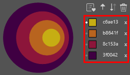
The hex list provides a list record of the current color scheme selections.
As swatches are selected on the main grid they are added to the top of the hex list and become available for direct selection to change the foreground color.
The order of the list can be drag and dropped to change the preview circles (described next).
Selecting the hex number will turn to edit mode where the hex number is highlighted to copy to the clipboard. Changes to the hex value while in edit mode will not change the original hex value.
Selecting a swatch here on the hex list will highlight the corresponding swatch on the selection grid and make it the current anchor for stepping. Selecting the anchor swatch again will remove the anchor and the indicator dot on the hex list.
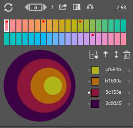
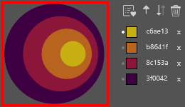
b) Preview Circles:
These circles are a distinguishing characteristic of Colorboss and provide a broad overview impression of how the selected colors work together as a combined theme or color scheme.
The last color selected is displayed in the center of the preview.
The preview colors will update location if the colors on the hex list are reordered by manual drag and drop, or if the reorder function buttons are clicked (discussed below).
During stepping, the number of visible swatches on the hex list and in the preview circles may reduce if there are no available swatch locations on the target hues during stepping. The original swatches are restored when the stepper is re-zeroed or reversed to a previous stepper value.
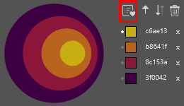
c) Add to favorites:
This will take the current hex selection list and store it as a row at the top of the Palettes library list available on the next tab. After the save the button becomes disabled to prevent accidental multiple additions of the same scheme.
However, changing the order of the scheme (and back again), or the number of swatches will re-enable the favorite button again and permit the color scheme to be added again to the Palettes library.
Colorboss allows multiple copies of the same color scheme to be deliberately added in case the same scheme is needed in a number of different Palette groups.
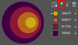
d) Ascending Order button
This button orders the hex list from top to bottom from highest value to lowest value, from highest chroma to lowest chroma, and if needed, from lower hue number to higher hue number.
This is useful to reset a scheme order to a visually consistent state after experimenting with hex ordering.
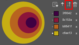
e) Reverse order Button
This button reverses the current order of the hex list and provides a rapid visual impression of the inverted color sequence on the preview circles.
The inverted hex list can be stored as a separate Palette color sequence using the add favorite button.
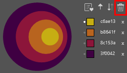
f) Trash Button
This button clears the current hex list, preview circles and selected swatches on the main selection grid
2. Palettes Tab
The Palettes tab is the central hub for managing and organizing your saved color schemes in Colorboss.
This powerful feature allows you to store, categorize, and quickly access the color combinations you’ve crafted in the Designer tab or imported from external sources.
Whether you’re working on multiple projects, exploring different color themes, or building a comprehensive color library, the Palettes tab provides an intuitive and efficient way to keep your color schemes at your fingertips. With easy-to-use grouping functions, drag-and-drop capabilities, and instant preview options, you can organize hundreds of color schemes into logical categories, making your workflow smoother and more productive.
The Palettes tab not only serves as a storage system but also as a dynamic tool that integrates seamlessly with your design process in Photoshop, allowing you to apply saved colors, or regenerate gradient maps and color balances with just a few clicks.
A) Grouping and Import/Export buttons
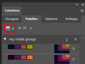
a) Add folder +:
Creates a new group folder in the library. Use this to organize related color schemes under a common theme or project. Upon creation, you can rename the folder to reflect its contents.
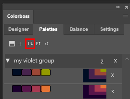
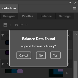
b) Import palette P↓:
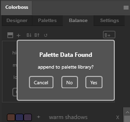
Imports a previously exported Palettes library from a JSON file. This function is crucial for restoring backups or incorporating color schemes from other sources.
The import process gives an option to import any balance data found in the JSON file to the balance library
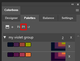
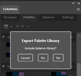
c) Export palette P↑:
Exports the entire Palettes library to a JSON file. This feature allows you to back up your color schemes or transfer them to another system. During the export process, you’ll have the option to include your current balance library, ensuring all your color data is preserved.
The export process gives an option to include the current balance library in the export file.
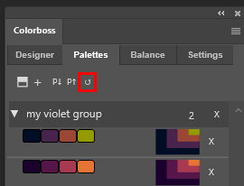
d) Refresh Button ↺:
Provides a quick way to refresh the Colorboss plugin and update the Palettes library list. This is useful if you’ve made changes outside the plugin or if you need to ensure you’re viewing the most current data.
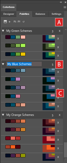
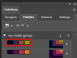
B) Color group folders:
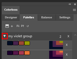
a) Expansion and collapse button:
The left arrow expands and collapses the group of color schemes below it.
When the group is collapsed the entire group can be dragged and dropped to another position in the list. If there are color scheme rows below the group row when it is dropped, these exposed rows will be incorporated in into the group and removed from their previous group. For this reason it is best practice to close all palette groups before dragging them to new locations on the list.
The group cannot be dragged if it is not collapsed and the arrow will flash a warning red if this is attempted.
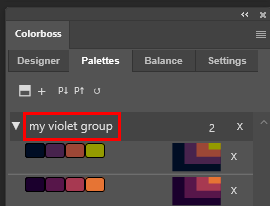
b) Group name:
When group folders are first created they are given a default name and number. Clicking on the label will make it editable.
The name of the group is user defined and describes the contents of the folder in a user friendly manner.
Multiple groups can have the same user defined name if required.
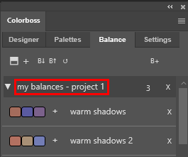
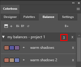
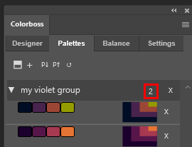
c) Group Counter:
A label that displays the number of schemes in the group, that updates automatically after drag and drop events.
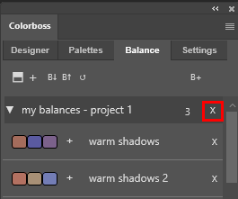
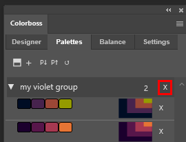
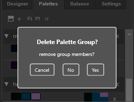
d) Group deletion button:
This will delete the entire group. An option to delete the group members will be shown in a dialog popup
When a group folder is deleted a dialog is presented to select if the member color schemes should also be deleted. Choosing not to delete the members allows the removal of the group folder and moving the remaining members to another group folder afterwards. This is useful in consolidating color scheme categories and group folders.
3) Color scheme row
a) Interactive swatches:
Each color in the scheme is represented by a clickable swatch element. Clicking a swatch sets it as the current foreground color in Photoshop, providing quick color selection changes during design work or workflows requiring rapid change such as photo colorizing or inking comic book outline artwork.
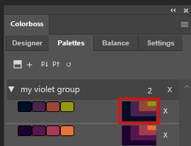
b) Color scheme preview:
The scheme preview shows the visual mood of the color scheme at the time of saving it to the library.
Clicking on the preview panel will reopen the entire color scheme in the Designer tab. Back in Designer mode the ordering of the color scheme can be changed or new colors added or removed before re-saving the scheme back into the Pallet library as a new entry. Reloading the color scheme back into the Designer tab will also allow Gradient maps and Balances to be generated from the color pallet.
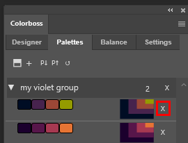
c) Scheme deletion button:
This will delete the entire color scheme row.
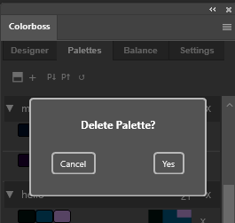
An option to confirm the deletion will be shown in a dialog popup if the ‘Confirm Deletions’ option has been checked in the Settings tab.
3. Balance Tab
The Balance tab provides an intuitive and efficient workflow for color balance management, fine-tuning the color mood of document images and maintaining consistency across a series of projects.
The feature-rich interface and Photoshop integration allows rapid testing and application of the balance settings directly to document images for color grading enhancement .
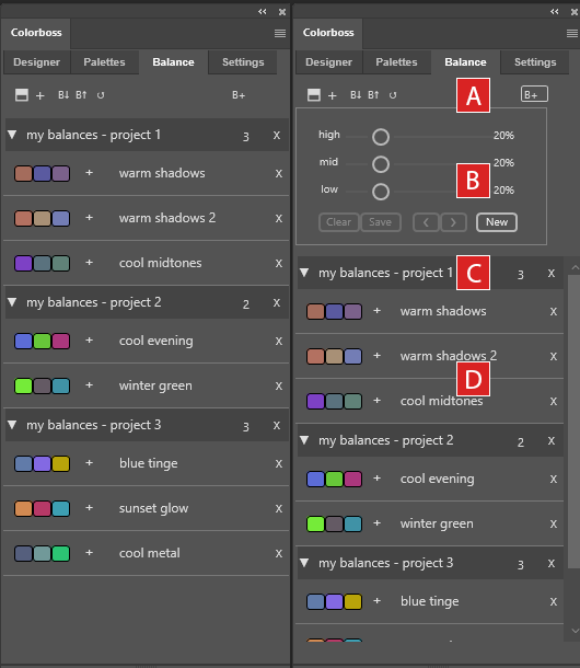
The Balance tab is divided into several key areas:
A) A top function button row for managing your balance library,
B) A random balance generator for creating new balance settings,
C) list view of balance groups and
D) individual balance schemes.
With this tab, you can effortlessly create subtle to dramatic color shifts in your images, targeting highlights, midtones and shadows.
Save or export your favorite balance settings for repeat future use, and organize them into logical groups for easy access.
A) Grouping and Import/Export buttons
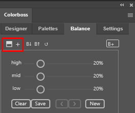
a) Add folder +:
Creates a new group folder in the balance library. Use this to organize related balances under a common theme or project. Upon creation, you can rename the folder to reflect its contents.
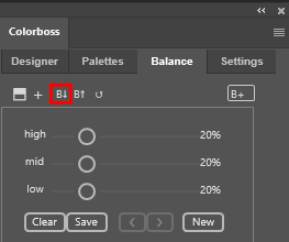
b) Import palette B↓:
Imports a previously exported Balance library from a JSON file. This function is crucial for restoring backups or incorporating balance triads from other sources.
The balance import process gives an option to import any palette data found in the JSON file to the Palette tab library.
c) Export balances B↑:
Exports the entire Balance library to a JSON file. This feature allows you to back up your color balances or transfer them to another system. During the export process, you’ll have the option to include your current palette library, ensuring all your color data is preserved.
d) Refresh Button ↺:
Provides a quick way to refresh the Colorboss plugin and update the Palettes library list. This is useful if you’ve made changes outside the plugin or if you need to ensure you’re viewing the most current data.
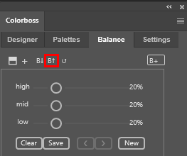
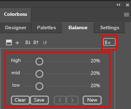
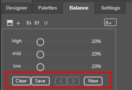
e) Open balance generator (B+):
The B+ button opens and closes a built-in auto balance generator.
The generator consists of three sliders and a set of buttons to manage the random balances that are generated.
B) Balance generator:
The balance generator creates new balances and immediately applies them on a new balance adjustment layer named ‘CB’ when the ‘new’ button is pressed.
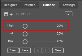
The interface sliders allows for a predefined limit to the range of color variation in the balance to be set for the high, mid or low level. The limit of variation can be set between 0% (zero variation) to 100% (maximum variation).
The lower the slider setting (i.e. 5%), the lower the limit of randomness of the balance away from neutral. The highlight, mid-tone and shadow (low) variation can be set independently.
The default initial limit on balance variation is 20%.
The ‘New’ button creates a new color balance and automatically applies it to a balance layer named ‘CB’.
Each time the ‘New’ button is clicked it creates a new random color balance in a temporary hidden list and updates the ‘CB’ balance adjustment layer with the last list balance.
Previous color balances can be reviewed by scrolling back and forth through the temp list using the arrow keys ‘< >’.
The ‘Save’ button adds the current balance to the balance library.
The ‘Clear’ button clears the temporary list – but does not clear the ‘CB’ balance adjustment layer from the document.
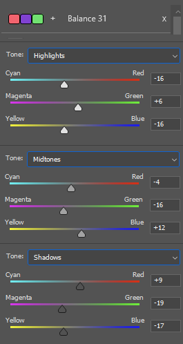
Pressing the ‘Save’ button adds a new balance to the library as a new row with 3 indicator swatches and a default name. The balance in this example is named ‘Balance 31’
Each indicator swatch represents an RGB cumulative deviation from neutral.
Pressing the swatch group or the ‘+’ icon adds the balance to the document as an adjustment layer. The image shows the 3 levels for ‘Balance 31’ – Highlights, Midtones and Shadows.
The left swatch is the deviation from neutral for the document Shadows.
The middle swatch is the deviation from neutral for the document Midtones.
The right swatch is the deviation from neutral for the document Highlights.
a) Expansion and collapse button:
The left arrow expands and collapses the balance group below it.
When the group is collapsed the entire group can be dragged and dropped to another position in the list. If there are balance rows below the group row when it is dropped, these exposed rows will be incorporated in into the group and removed from their previous group. For this reason it is best practice to close all balance groups before dragging them to new locations on the list.
The group cannot be dragged if it is not collapsed and the arrow will flash a warning red if this is attempted.
b) Balance group name:
When group folders are first created they are given a default name and number. Clicking on the label will make it editable.
The name of the group is user defined and describes the contents of the folder in a user friendly manner.
Multiple groups can have the same user defined name if required.
c) Group row counter:
A label that displays the number of balance rows in the group, that updates automatically after drag and drop events.
d) Group deletion button:
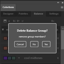
This will delete the entire balance group. An option to delete the group members will be shown in a dialog popup
When a balance group folder is deleted a dialog is presented to select if the member balances should also be deleted. Choosing not to delete the members allows the removal of the group folder and moving the remaining members to another group folder afterwards. This is useful in consolidating balance categories and group folders.
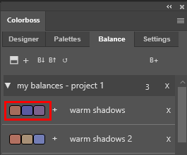
a) Interactive balance swatch:
Each balance row is represented by a clickable swatch triad. Clicking the swatch triad adds a balance adjustment layer of the same name in Photoshop.
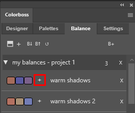
b) Add balance (+):
Each balance row has an add balance button (+). Clicking the button adds a balance adjustment layer wiith the same name in Photoshop.
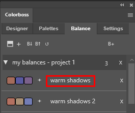
c) balance name:
When balances are first created they are given a default name and number. Clicking on the label will make it editable.
Here the default name has been edited to ‘warm shadows’
The name of the balance describes the balance in a user friendly manner.
Multiple balances can have the same user defined name if required. This is helpful if the same named balance appears in more than one group.
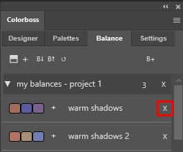
d) Balance deletion button:
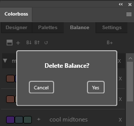
This will delete the entire balance row, possibly with a deletion confirmation dialog.
An option to confirm the balance deletion will be shown in a dialog popup if the ‘Confirm Deletions’ option has been checked in the Settings tab.
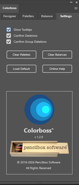
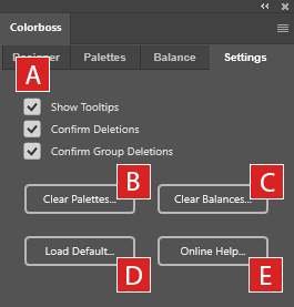
4. Settings Tab
A) Checkbox Options
1) Show Tooltips:
Turns on/off the tooltips.
2) Confirm Deletions:
Checks if deletion was accidental.
3) Confirm Group Deletions:
Checks to also delete members of the group.
B) Clear Palettes Option:
Option to delete all the color scheme entries and groups in the Palettes Tab library. Gives a warning that this cannot be undone. Best practice is to backup the library first by exporting the library as a .json file.
C) Clear Balances Option:
Option to delete all the balance scheme entries and groups in the Balance Tab library. Gives a warning that this cannot be undone. Best practice is to backup the library first by exporting the library as a .json file.
D) Load Default:
This option will add the default color schemes to the Palettes and Balance libraries. There is no check for duplicates and the colors are simply appended to the current library lists.
E) Online Help:
This option opens the default browser to this current webpage as online user manual for help.


